Portfolio Sections
- A. Final Product: Main Product (1)
- B. Final Product (Ancillary Tasks) (2)
- C. Evaluation - Question 1 (1)
- C. Evaluation - Question 2 (1)
- C. Evaluation - Question 3 (1)
- C. Evaluation - Question 4 (1)
- D. Appendix 1: Research for main product (8)
- E. Appendix 2: Pre-Production planning for main product (5)
- F. Appendix 3: Research for ancillary texts (8)
Friday, 8 April 2011
Tuesday, 5 April 2011
Tuesday, 8 March 2011
In what ways does your media product use, develop or challenge forms and conventions of real media products?
Horror Conventions
In Triquetra we have tried to use a range of horror conventions to exploit the full potential of our idea. I feel that we have achieved that by ease and, as always, there are some that work better than others. In our piece we have used a vast number of close ups. There are shows in the eyes and on shots such as dragging feet. Close ups are a convention used in horror quite a lot. They give the sense of invasion of the audiences personal space and that is one of the effects we hope to have on our audience. Usually horror takes place in isolated/abandoned locations, such as factories and forests. We used a number of locations to show the audience that it is not all in one place. We did keep the 'Out of hours' theme but were able to discreetly add in a little bit more action.
For shot 8 above we shot it at a canted angle and then rotated the clip on the computer which disorientated the audience a little bit to which Lizzie then appeared to surprise and shock them. The great thing about shooting a horror is that there is no end to the possibilities of camera angles. On 'Devil' trailer (see earlier post) the titles are shown on a 180degrees rotated city. Anything is possible and most have great effects. A quick shot on our trailer is hand held to give a sort of human perspective to the scene. Like it is an actual person and not a camera.
1. This shot on the stairs we filmed with dimmed lights as we wanted to create tension. The low key lighting creates a shadow on the stairs that we have enhanced to create a more eerie feel to walking up the stairs.
2. For this shot at the very beginning of the trailer we used a handheld camera to give the effect that someone has come across the body. This scene also raises questions like who is he? What is he doing there? We chose a medium shot and then panned across the whole body but only part of this full take made it to the final edit. Having a dead person with no identity and no reason why they are there is a typical horror convention.
3. This shot took us a while to get correctly because at the time we were filming the moon was the wrong shape and size so we had to wait until it was right for us to get the target. It shows the sort of supernatural theme we had incorporated into our trailer.
4. The extreme close up of my eye is used to try and make the audience feel uncomfortable. The closeness of the eye invades there space and gives a sense of possible entrapment, it also opens really quickly and allows us to feel the fear that the man is going through.
5. This shot I had thought of from the very beginning. The intended affect on the audience is to shock them and make them aware that something is not right. To film this we had to get the camera right in Lizzie's face and we made the scene look darker as 'scary' things typically happen at night.
6. This clip is one of my favourite parts of our whole trailer. We filmed Lizzie walking in 5 different places and using Final Cut Pro we added the 'Bad TV' effect which allowed us to get this super effect. To get the whole effect we placed one shot after the other and added the 'Bad TV' to every other shot which made it look like the, now possessed, girl is jumping as supernatural beings do.
7. This scene is another effect that we were able to achieve through Final Cut Pro. We took two identical shots and placed them one on top of the other. Because they are both identical what ever moves will be shown. The male in the shot walks across so we changed the opacity of that shot down to about 35% and it now looks like he is the ghost. This is not as common as most people think because horror movies like to show what the ghost does rather than the ghost its self. In The Shining for example the ghosts are the twins yet they both appear although the kind of ghost in our trailer is a stereotypical one I think that it works.
8. In this shot we decided to use a shot that can be used in a number of different ways. The classic mirror shot is a great horror convention and is used in many horror movies including on the poster of The Unborn. To achieve this we did the same as the ghost shot, filmed the same shot and then added Lizzie to make it look like she appeared. We want this shot to make the audience jump and to try and find them on a false sense of security as there is not a lot of action building up to this shot. The action happens after this shot and I think this breaks the ice.
9. This shot pans to a focus pull showing our female protagonist through the bars of a steel object showing the audience how she can blend in with everyday life but we know that she is so much more which poses a threat to the world of the character. We filmed this by setting the tripod up behind the steel frame with Lizzie some distance in front. We zoomed in slightly to get a perfectly framed shot and focus pulled to reveal Lizzie blended into the society.
Trailer Conventions
To begin with a teaser trailer is normally around about a minute long to give the audience an insight into the play and make them want to see the theatrical trailer and hopefully the full length film when it is released. Although our trailer is 1:44 seconds long the actual footage in it is around 1:10 and the rest are inter titles. Trailers are designed to cause an explosion in the audience's head which entices them to see the movie. Although we do not specify that our trailer is a horror I believe by the clear drone at the start and the mood/tone of our trailer, that our intentions are clear. We include the name of our Movie and through ECU's, use of ghosts and disorientating shots that the audience can figure out that it is a horror.
We tried to incorporate aspects that our target audience of females aged 15-18 would enjoy. As our research found out that the audience preferred psychological horror we didn't use as much blood as some horror movies use i.e around the neck and all over faces, we had some on Ellen's face and around the hands of the mysterious man. Other than this it was mainly chasing and being scared of Lizzie. Although our soundtrack worked well with our piece I felt that it could have been more dramatic and built more suspense leading up to the ending. For me it was too 'in your face' the whole time and at times could have contrasted to the visuals. In other trailers that have been created in my year I feel that our soundtrack is the weakest in terms of building suspense. Our inter-titles are distributed across the majority of the trailer, but towards the end when the action starts to really build up we thought that if we had inter-titles it would break the suspense so we decided to have shot after shot of action building up to the finale.
Monday, 7 March 2011
Friday, 4 March 2011
How did you use media technologies in construct, research, planning and evaluation stages?
Mac: Without a mac this trailer would not have been possible. We used a great deal of footage to construct our trailer and memory from the mac and the programs we used were only available on the mac. The wide screen and sheer size allowed us to see each effect we added very clearly whether it be changing the colour of the scene to adding 'Bad TV' effect.
Facebook: Facebook allowed us to carry out audience feedback by posting the youtube link on our walls and allows all of our friends to watch it and tell us what they thought. We were also able to post the surveymonkey URL on there so that they could fill out our questionnaire which gave us our beginning research.
Photoshop: This is what we used to create both our ancillary products. We could layer, add effects, rotate and, well, pretty much anything on this program, the limitations are endless. I depended on use of layers for both my poster and magazine as I could overlap and add textures to the background/foreground.
LiveType: For the first couple of inter-titles in our trailer we used ‘LiveType.’ This program allowed us to create different effects in a massive range of fonts for different effects. For example, the very beginning of our trailer sees a tilt up on the silhouette of a building and over this we see ‘Wicken production presents.’ This is in a very gothicy style of writing which relates to the theme of the complete trailer. There are many more effects for instance ‘Live fonts’ which is moving fonts which you can place on footage if you pleased.
Blogger: This is where we blog our entire coursework. Its ability to let us post/link and organise all of our writing, add colour, links and pictures is a really good way to show what we are capable of. We could access it at all times and our teachers are able to see if we met deadlines too!
Camcorder: We used this to film our trailer. We were able to get canted angles, weird framing and to help us we could use a tripod.
Camera: As we went along we took pictures to show the process of us filming but we later realised that none of them were suitable for our ancillary products so we had to go out and shoot again!
Garageband: Using garageband I found really hard to use in the beginning but when I got my head around the concepts of it we were able to figure out how to add tracks and we put our soundtrack, which I thought was ok but not perfect, together with the trailer and created a few effects that remained in the trailer itself.
Google/The Internet: One of the most significant and revolutionary things known to man. I was able to undertake extensive research into the horror genre, different movies, posters, magazine covers and get sounds. This trailer would not have been a tenth as good if it was not for the internet.
Final Cut Pro: This program allowed us to put together our raw video and add effects to the footage a good example of this would be turning a daylight scene into a night scene. We were able to layer different scenes which allowed us to create horror conventions. For example, increasing the contrast and lowering the brightness we were able to increase shadow opacity and make them really stand out. We could also place one scene directly on top of another created the illusion of a ghost (because both clips were identical we decreased the opacity of the clip with the moving person on it and only the movement is visible. We could add effects such as 'Bad TV' and changed the footage like Photoshop allows us to change a still image. This is a superb program and worth the time and effort to get to use because the time really paid off as you can see in our trailer. To begin with it was hard but we found out how to import the footage. There was a timeline at the bottom which allowed us to put on certain clips, we could choose how much or little we wanted of a clip and then we could fade it in or out or just directly cut it in so it just appears. Changing the hue, saturation, contrast was a piece of cake for this program and after a while the shortcuts were much easier to use.
The evaluation for this project was helped massively by the use of the blog and computer software. Instead of handing in an essay for the justifications and other elements I was able to illustrate my thoughts and ideas of why my group chose the outcomes. Final Cut Pro allowed me to put into detail what I thought of evaluation point 2. I was able to do a voice over my trailer and add in visuals so the audience could see what I was talking about and how it was relevant. I prefur doing a blog to writing an essay because where I am not so good at writing essays, I can use pictures, colourful writing, links and videos to demonstrate my knowledge and understanding.
Throughout this project I have used a number of different programs which allowed my group and I to achieve a great range of styles and conventions.
What have you learnt from your audience feedback?
The prime target audience of our horror trailer is males and females aged between 15 and 18. We realise, as with any other movie, that other age groups will watch our trailer but this is our core target. We worked out who are target audience would be through are audience research/questionnaire. As our percentage was sided just a little bit towards females we decided that we should aim our trailer at females but also include the males. As well as getting class feedback after viewing our trailer it was posted on Youtube which would allow anyone in the world to view and leave us feedback. We also got feedback from family and friends who told us honestly what they thought. As well as having good points it is always a constructive idea to have bad points to work on. As a distributor opinions from film critics would be greatly appreciated as it would allow us to change and/or improve our trailer.
Positives
From the feedback our peers gave us we found out the following good points; The use of ECU's specifically on the eye towards the beginning made the audience feel invaded which was our intended intention. They liked the setting of the abandoned field and isolation from the world which fits in with the theme of witchcraft. They picked up on the relationship between the male and the female and the choice of these characters. They said the ghost scene worked well with seeing him dead at the beginning. We did get praised for the use of this effect as we were the only group to use this but overall they thought it worked well. The zoom up the stairs worked again with the theme of entrapment. The shot length they though worked really well with 'punchy' shots, the fade on the moon worked well and all of this put together worked well to create a 'distressed' atmosphere. When we started talking about sound they all thought that the sound worked well with the genre and when we hear the heartbeat it creates extra tension and suspense. The low drones of the music works well with the witchcraft theme. Finally for positives they all thought that the narrative is quite clear and the protagonist together with the dilemma are presented effectively.
Negatives
Our class thought that although the mirror scene does work maybe the pace of the shot, could have been faster as well as the editing pace.The way in which it turns quite slowly to reveal Lizzie behind had a delayed effect on the audience and as we faded the shots together unfortunately it looks like a fade. Pace was picked on quite a lot, I think that we could have sped up some shots as the pace was broken when you look at it from a critical point of view. They also thought that as well as being too long, some shots became slightly repetitive. With the slow pace of some parts they thought that they lost concentration too. They thought that the scene with Ellen was a bit random and didn't fully understand her role. Some people thought that the inter-titles were too small and the font for some of them were hard to read/didn't fit in, some people also thought that the font should have changed more as it was the same the whole way through. Finally we got told us to increase the intensity and tension of our piece we could have sped the footage and soundtrack up.
Existing Horror Posters and Magazine Covers
Please Click on them to view in Flickr
Thursday, 3 March 2011
Triquetra Horror Trailer
Tuesday, 4 January 2011
Key Conventions of Horror
What are the key conventions of Horror?
 Many elements make up a horror movie and there are many conventions which piece together to allow a director to create the horror effect. I am going to distinguish the key conventions of the horror genre and apply them to 3 main horror movies which I have studied; Halloween (1978); The Shining (1982) and Eden Lake (2008.)
 To begin with, setting is a very big part of a horror movie. If the setting isn’t right then the film will be a disaster. In horror movies, the setting tends to fit into one of the following categories. Firstly a small community, or an isolated place which allows the thought of the community to encase a secret which may be triggered. Secondly comes places with past history which will return, one that is used considerably is an old abandoned house. These normally are ex-homes/lunatic asylums that have different levels including cellars and attics. These are all places for our horrors/monsters to
  inhabit. For example attics are high above the four walls in which we live but how safe are we? They connote repressed terrors and cellars; our primitive instincts. Finally with setting 99% of main horrors take place in the dark. Although action may take place in the daylight, main killings are normally at night. Some horrors have the ‘tough’ guys messing about during the daylight but when it gets dark the monster is unleashed ‘out of hours!’ All of the horror movies I have studied are suitable for this convention but the one I feel fits in most would have to be ‘The Shining.’ The reason for this is because that after Jack and
 his family have travelled to the hotel there are no other real settings throughout the movie. All of the action takes place at the hotel whether it be loving Danny or killing Haloran. As well as being isolated, the hotel has many different levels and its ‘past’ is Grady killing his wife and two daughters. Daylight and night-time are mixed a lot through this film so at some points it is hard to see whether it is light or dark. At the end of the movie however, we see Danny and Jack running through the maze and this is one (if not the only) scene that happens outside the hotel once they have arrived. It fits in with the point of dark events and the darkness does also connote evil.
 Another convention used is the way the camera is used to create different effects. Extreme Close Ups (ECU) are used many times throughout a horror film. They place 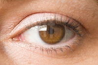

the audience in the eyes of the victim which allows audience identification. This effect can be used, as I have already said, to identify with the victim but also builds tension and suspense as you don’t know where the creature/monster is. We could also reverse this effect by having a sudden ECU to the monster’s eyes/face which would be seen as invasion of our personal space. You must not confuse ECU shots to Point of View (POV)  shots. A POV actually puts the camera (the audience) into the eyes of that character. These POV shots can be used in a wide range of effects to connote different situations. For example, hand-held connotes unsteadiness and often puts the audience into the monsters’ eyes. A long take, for example, the beginning of “Halloween” shows the bad deeds that a monster may do or a major part of the narrative. A good example of this would again be “The Shining” where Jack is using an axe to break down the door and he uses the famous line “Here’s Johnny!” which we then see an ECU of his face looking out of shot. This shot exaggerates his facial expression and puts the makes the audience feel like Jack is invading their personal space which, I think, is the intended effect.
 shots. A POV actually puts the camera (the audience) into the eyes of that character. These POV shots can be used in a wide range of effects to connote different situations. For example, hand-held connotes unsteadiness and often puts the audience into the monsters’ eyes. A long take, for example, the beginning of “Halloween” shows the bad deeds that a monster may do or a major part of the narrative. A good example of this would again be “The Shining” where Jack is using an axe to break down the door and he uses the famous line “Here’s Johnny!” which we then see an ECU of his face looking out of shot. This shot exaggerates his facial expression and puts the makes the audience feel like Jack is invading their personal space which, I think, is the intended effect.
 Depth of field is very important when trying to create the, sometimes comical, effect of the monster reanimating. A 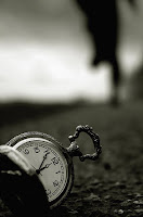 good example of this would be in “Tormented” although I haven’t studied this film we did go and see it as a media trip. In one scene Marcus (played by Tom Hopper) is in the shower after playing football and it shows a hand grab his towel. He finishes in the shower and realises his towel has gone. At this moment the focus goes from him to where his towel was. Another focus pull occurs when Darren Mullet (Zombie) has just been knocked down and Marcus has pushed his eye back into its socket. We see Marcus in focus as he thinks everything is back to normal which is when the focus pull occurs and we see Darren sit up straight to which the focus then changes to him as Marcus turns around.
 good example of this would be in “Tormented” although I haven’t studied this film we did go and see it as a media trip. In one scene Marcus (played by Tom Hopper) is in the shower after playing football and it shows a hand grab his towel. He finishes in the shower and realises his towel has gone. At this moment the focus goes from him to where his towel was. Another focus pull occurs when Darren Mullet (Zombie) has just been knocked down and Marcus has pushed his eye back into its socket. We see Marcus in focus as he thinks everything is back to normal which is when the focus pull occurs and we see Darren sit up straight to which the focus then changes to him as Marcus turns around.
 Sound is also crucial to generate the correct atmosphere in a scene/movie. A horror that uses sound effectively is “Paranormal Activity” In this film we hear many times at night footsteps from outside the bedroom. This works because all of the steps are equally distanced apart and eerily paced. We don’t see anyone besides the characters in the room yet a shadow on the wall reinforces that there is a spirit present.
 Lighting is also expressive throughout horror. Most horrors have non-realistic lighting which creates high contrast with low key lighting to emphasise shadows. Sometimes the lighting can be at weird angles to create abnormal shadows; this could be achieved if the light were placed below the object/person. One of the films I have studies achieves this effect quite successfully which is “Eden Lake” where the main protagonist and her husband are captured by a group of teens and placed on a bonfire to burn to death. The bonfire is set alight and the main female manages to escape but we can then see that the leader of the gang sets the new kid alight which suggests that he has a devilish personality as he is willing to set an innocent child alight which shows he has no mercy.
Next we move on to the narrative structure of a horror movie. The classic Hollywood narrative protagonist that we see at the end is more commonly known as the “final girl.” Normally found in the slasher genre, the “final girl” survives at the end and often defeats the monster/villain. This shows the point of masochistic identification for the audience which is more complicated than that of other horror genres. A good example of this would be “Halloween.” Throughout the movie we see the life of Laurie and as an audience are forced to identify with her the whole movie. At the end we see her fight for her life as well as trying to save the little boy and girl. From this angle we can see that she could also be targeted as the hero.
A theoretical feature with the slasher horror is how a past childhood experience turns the child into a psychopathic killer. Again, “Halloween” would be a good example as the beginning of the movie shows Mike Myers killing his sister Judith with a knife. He then returns many years later and does the same. His childhood turned him into this killer and now he will strike again.
Character types are much defined in a horror and are used in many different ways. The main types are as follows;
• Wendy/Danny in The Shining
• Jenny in Eden Lake
· The Monster/Villain/Psychotic killer - • Mike Myers
• Jack
• Group of Teens
· Children - • The little Boy and Girl in Halloween
• Danny/Tony in The Shining
• Some of Brett’s gang and the little boy that sketched in Eden Lake.
Some other character types that don’t necessarily apply to my 3 studied movies are;
· Ineffectual Police
· The ‘Have a go’ Hero
· Scientists that over reach their power
· People who refuse to believe.
Finally the themes of the horror genre. Binary oppositions used in horror movies can be quite varied. For example you may get a human vs. non-human horror which is mostly exemplified with “Men In Black.” The most common in my 3 horror movies is good vs. evil. These are Jack from “The Shining” Brett’s Gang from “Eden Lake” and Mike Myers from “Halloween.” Return of the repressed is very much made a point of in “Halloween” as all of the killings being either, before or after sex. In my 3 horror movies horror has defiantly reinforced the dominant ideology of the male. All three movies have a dominant male killer/leader (Mike Myers, Jack and Brett.)
Furthermore, we can now see from the evidence above the main conventions of the horror genre and how they are seen through 3 different horror movies.
Thursday, 2 December 2010
Audience Research
For audience research I made a questionnaire for my peers and others to fill in. From this I hoped to gain knowledge of what attributes made horror films for other people and based on this I would intergrate them into my trailer.
Around two thirds of the people I asked were female which means my research will be slightly towards the female gender.
What is your age?
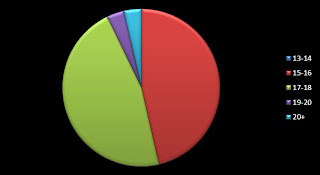 This question enabled us to see what types of horror a wide range of ages are into. From this chart we can see that the main two audiences are 15 - 18 year olds which is the range for horror.
Do horror movies interest you?
This question is interesting as we can see that not all people are interested in horror. Although a majority are interested there are a select few that do not find horror movies appealing.
How regularly do you go to see a horror movie?
Knowing how often your audience go to see horror movies is really important. We can see here that half of the people we asked go to see horror movies occasionally. This gives us the idea that horror movies are popular but also indicates that you may have to be in the right mood to go and see one.
What is it in a horror trailer that makes you want to watch the film?
This question allows the makers/distributors to see what draws an audience into a horror movie. Although it is not clear we can just see that suspense is the most popular following stars/directors closely. This allows us to incorporate a few select things into a horror trailer. As you can tell by just looking at this graph all of the options for the question have a substantial amount of votes meaning that an audience expect to see all of them in a horror movie.
What is your favourite type of horror movie?
What is your favourite type of horror movie?
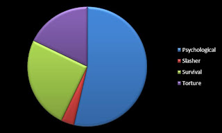
This is the most important question we asked and shows us the types of horror the audience are interested in. We can see by a great majority that psychological was the favourite. Survival was 2nd which shows us that not all of the intended audience are greatly interested in blood and gore. I believe that the thrill from watching psychological horrors is having your mind played with and shocked through many different techniques whether it be ECU's, canted angles or fast paced music. All of these group together to give the audience a sense of excitement.
Monday, 29 November 2010
Planning and Distribution
The Distributor
- The film distributor is the company or individual responsible for the release of a film whether it be a DVD release or a TV release. A distributor may do this directly or through theatrical exhibitors. If the distributor is working with a theatrical exhibitor then they will secure a written contract for the amount of gross ticket sales which will go to the distributor. The distributor must also make sure enough film prints are struck to service all contracted exhibitors for the agreed opening day, ensure that the film is physically delivered to the exhibitors and also make sure that the film is shown in the correct sized screen with the minimum number of seats agreed. In addition to this the exhibitor must also keep to the agreed showing times and return the prints' are returned at the agreed date/time.
PLANNING A RELEASE
- When planning the release of a film it is important to understand how and when the film will be released. The distributors must also gauge the audience for each film taking into account through use of market knowledge, self-judgement and statistical research. Although having a main target audience they must think about attracting a wider audience.
- Distributors must also take into account the following:
- What stars/celebrities (if any) are there in the film?
- Is it being released at a school/holiday time?
- What certificate will the film be?
· Distributors will need to work out where the film will be shown, at what screens and for how long. This will depend on how popular the film will be and whether the cinema's will want to show the film. The budget is worked out when the distributor has seen the finished project and has confirmed the release plan. The distributor pays for everything in post-release including, the pictures for the film, advertising and marketing costs.
MARKETING PLAN
- As well as a distribution plan, every film is complemented by a detailed marketing plan. This plan has 3 sections, first comes Who? What? Where? When? How? In order for the film to be successful the distributors need to know the core target audience and plan how they are going to sell this movie to them. Strategies to motivate audiences' awareness/interest in the film. If the film does not interest an audience then there is no point to it being shown. It needs to be caught by the audience and then explode in a world of suspense to draw the audience in. Creative - Media - Publicity - Promotions - Online - Partnerships. All of these come together to form the basis of what the film can be released on. The marketing objective is to create visibility and make the audience engage with the characters. Make them want to watch the film and more importantly, stand out from all other films. Before the film is even released the poster will go up at cinemas to inform the audience that the film is on its way. This poster needs to stand out from the rest and convey the message that the distributor and film makers have intended for the film.
Media Advertising
- Throughout the year the media costs rise and fall according to the market conditions.
 Television is the most effective method of advertising because of the direct link to a mass audience. But as the tv suppliers know this the cost of advertising can cost hunderds of thousands of pounds! (or more for all regions)
- Posters are also a effective way of advertising movies. There are approx. 250,000 poster sites across the UK. Whether they be at road sides (motorways) or railway platforms.
Publicity
- The most common use of publicity is interviews witht the cast and crew of the movie. This gives us an indepth idea of what the film is about and how the people on the film intend the message the movie holds to come across rather than reviews on the film of how the audience see's it.
- As for the films offical pictures a professional photographer is hired to take fine images which are approved for publicity use.
- Promotions are arranged with the distributor and and can include compititions and collectables. They can be put on items such as crisp packets, bottles of coke etc. This allows a wider audience to be informed about the release and also win prizes related to the movie.
- Shops and restaraunts may also opt in to promoting a film by hanging boards above isles for all the customers to see or if a restaraunt, special meals. One of the most common examples of this would be the McDonalds "Happy Meal"
Subscribe to:
Comments (Atom)


